Without gathering user feedback, making any changes to the user experience is like taking a shot in the dark. You have no idea whether your efforts align with the needs of your users, leaving them with a pretty poor experience. We recently improved the UX of our feedback inbox overview page, so you can scan incoming feedback even easier than ever before. We wanted to redesign this page with our users and their needs at the centre of the user experience. And how exactly did we do that? Good question! Keep reading to find out.
A great experience starts with a question
Here at Mopinion, feedback is in our DNA. We make it a priority to put the needs of our users at the heart of everything we do. Why wouldn’t we? Feedback allows us to continuously improve our platform as our users’ needs and challenges evolve.
So it’s no surprise that when we decide to make changes to certain aspects of the Mopinion platform, we do this with you, our users, at the centre of every decision.
The goal
Our goal was to maximise our users experience by making this page more intuitive, and even easier to scan. This makes it even easier for you to quickly check out incoming feedback, so you can use our feedback management system to take action and make lasting improvements that will benefit your organisation and your customers.
But how were we able to design the new feedback inbox overview with our users opinion’s in mind? You guessed it – with a Mopinion feedback form of course.
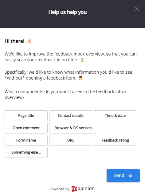
We decided to deploy a feedback form inside the Mopinion platform to specifically ask users about the feedback inbox overview. We wanted to gauge what information is most important to our users.
And what better way to find out than by simply asking them?
The feedback form
We used a multiple choice style feedback form to gauge which information is important to show in the feedback inbox overview. Have a look at our feedback form below.

The Result
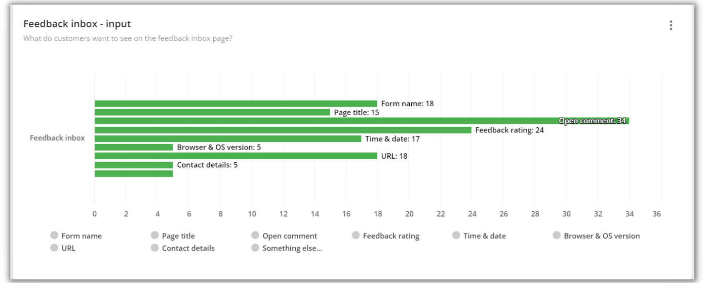
After leaving the form live for a while, we received many responses. It was clear as day which information was most important for our users to see in the feedback inbox overview.

A new and improved feedback inbox overview thanks to our users’ feedback
After deploying the feedback form inside the platform and gathering a decent number of responses, our product and development team quickly got to work improving this page.
They first wanted to make the page more intuitive and user-friendly, by improving some smaller design elements. Then, most importantly, they wanted to display the relevant information clearly, so you could quickly scan through incoming feedback and easily spot trends or identify common issues.
Although the new and improved feedback inbox overview page has not changed drastically, with these small improvements, the inbox overview is even more intuitive than before, displaying the most important and relevant information.
Inside Mopinion:
Powering UX Design with Feedback
More value, less effort
As we mentioned above, even very small changes can have the biggest impact on your users’ experience. Our brand-new feedback inbox overview allows you to quickly scan the feedback, thanks to the new sorting of information.
Open comments are now fully visible on the overview, and you can now see upfront which form a feedback item is from. It’s never been easier to spot trends, identify a common issue or, if you’re lucky, a common reason for positive feedback.

This new and improved overview means taking action with the feedback you receive is also even easier than before. Get key information faster than ever, then use our action management tools to follow up, share the feedback with the right team and drive decisions with your users’ feedback.
Continuous improvement
“Strive for continuous improvement, instead of perfection.”
Kim Collins, Olympic Athlete
After releasing the new and improved inbox overview, we didn’t stop there. We made sure to gather even more feedback, to find out what they thought of the improvements. We wanted to let you and other Mopinion users know that your feedback has been very valuable, particularly after we implement something new. So, we deployed another feedback form simply asking what they thought of the new feedback inbox.

After leaving the form live for over a week, we managed to get some helpful feedback to further iterate on this page. We discovered that some of our users were missing the visibility of the tags in the overview, and the new setup wasn’t directly showing as many as before.
We came up with a solution to show as many tags as possible before they would collapse, as well as implementing better interactions when hovering over feedback items. This, along with other small UX improvements were quickly implemented by our development team, thanks to your feedback.

Read the full release note on the Mopinion changelog.
Taking action and closing the loop
If your audience takes the time to leave you some feedback, you owe them the respect of taking what they have said on board. Use this information to improve their experience whether that’s via your app, website or email marketing efforts.
One single feedback response can influence your whole company vision, it can let you know where you are with your strategy and whether your experience aligns with your target audiences’ expectations. But, that’s only if you take action with the feedback. This means, creating a customer feedback loop.
Mopinion has plenty of great features for managing your feedback. Use our auto tags and labels to categorise the feedback and assign actions to individual feedback items, add notes or assign feedback items to other members of your organisation. The next step is to use the chart builder to visualise your data and build a custom dashboard suited to your goals.


